Michelle Meyer
Graphic Design & Illustration
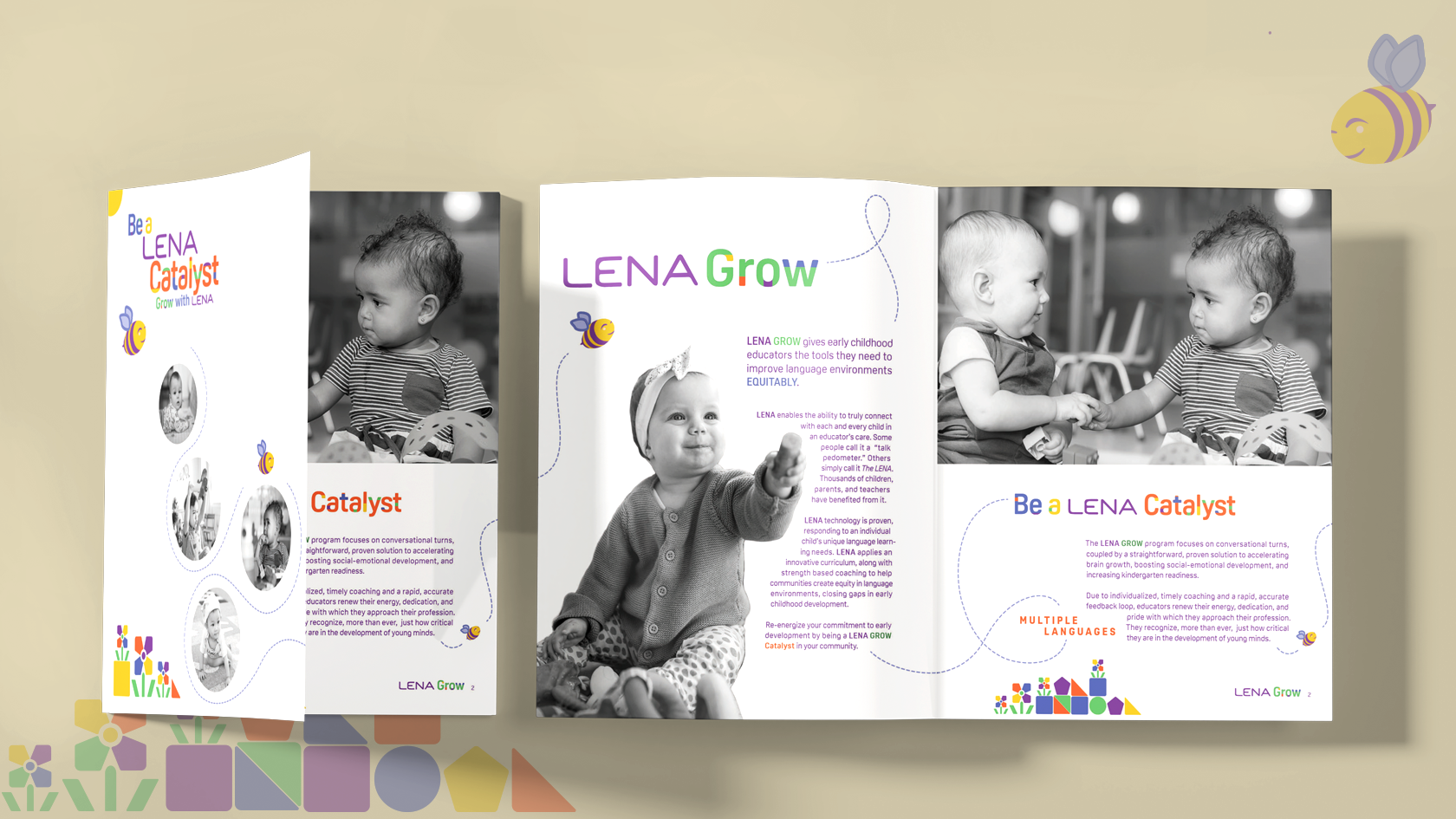
Be a LENA Catalyst: Grow with LENA
LENA stands for Language ENvironment Analysis. The LENA Grow program utilizes AI to provide real-time information, assisting educators in creating optimal learning environments during early childhood development. The goal of this project was to create accessible, post pandemic, relevant outreach. The outreach is designed to empower advocacy in communities across the nation. It is an effort to reach all concerned with early education: including children, educators, siblings, parents, grandparents, daycare providers, health care providers... The material is designed with inclusive thoughtfulness, representing diversity within the education system.
- Skills: Long Format Copy, Brand Identity Extension, Typography, Vector Illustration, Batch Photo Treatment, CMYK Print Production
- Programs: Adobe Photoshop, Adobe InDesign, Adobe Illustrator
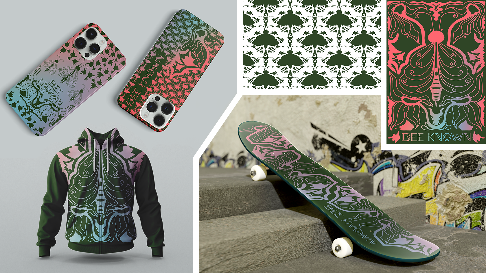
Bee Known
Bee Known is a Folk Art inspired Procreate illustration which has been extended to include a split fountain gradient color treatment in Adobe Photoshop. Once the illustration was migrated to Photoshop, I reshaped the elements to make a woodblock cut inspired bee pattern. The design, while not connected to a specific corporation, has the ability to traverse a diverse variety of surfaces. The illustration started as a journal cover, but once complete, directed the design aesthetic. As one of the original flower forms is similar to the body language of a surfer or skateboarder. So, I approached merch dev with that narrative in mind.
- Skills: Folk Art research, Concept sketch, Procreate illustration, Adobe Photoshop pattern reshaping from exported Procreate illustration, Adobe Photoshop warping, reshaping, resizing elements, Adobe Photoshop gradient coloring, Adobe Photoshop mockups, Apperal Design
- Programs: Adobe Photoshop, Procreate
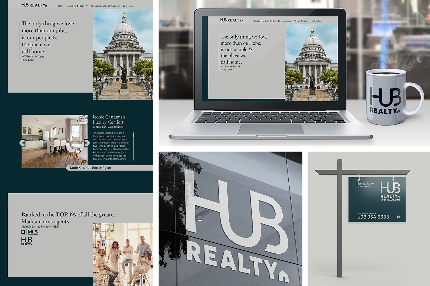
HUB Realty
HUB Realty is near and dear to my heart, as a local business. The project initiative was to develop a rebrand which focused on their strong Wisconsin roots and highlighted their level of experience. Experience which makes home buying and selling feel effortless. The Community Focused, Family Centered concept idea lets HUB shine through simple elegance, clean, modern aesthetic and accessible navigation.
- Skills: Concept Design, Idea Statement, Logo Design, Landing Page Design, Color Concept, Typography Design, Brand Guide Design, Interior Environmental Graphic Design, Exterior Environmental Design, Apperal Design, Social Media Design, Pattern Design, Idea System Statement, Sign Design, Brand Design
- Programs: Adobe InDesign, Adobe Photoshop, Adobe Illustrator, Adobe After Effects, Adobe XD
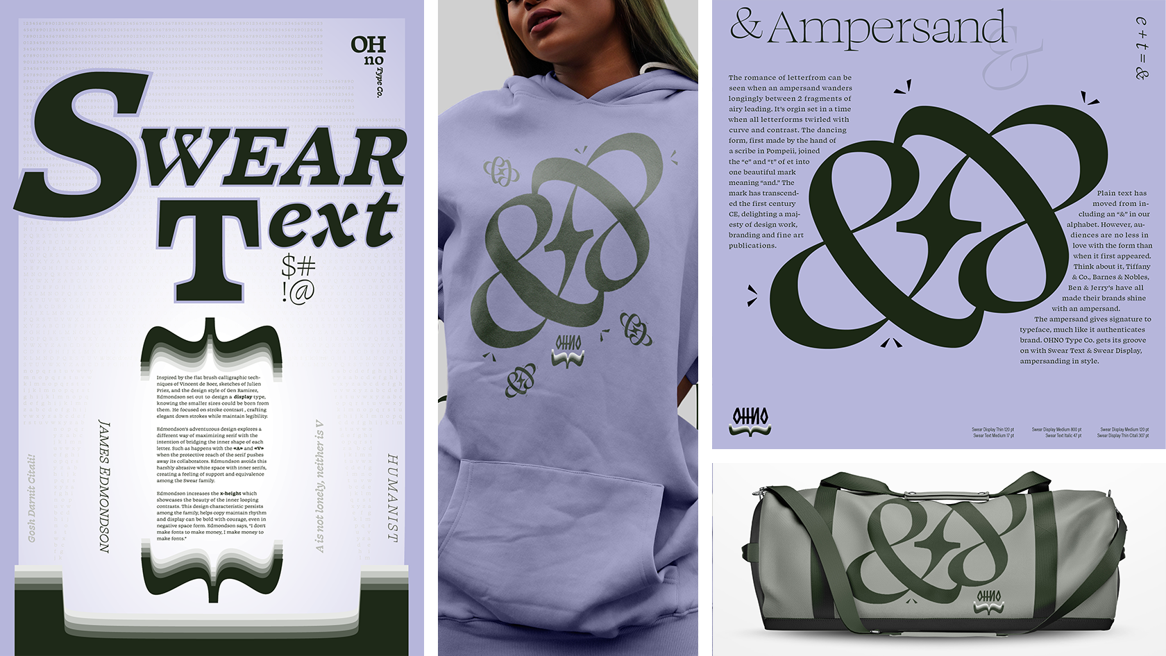
Swear Text
Humanist appeals traverse direction, coloring my swear words with emotion. I love adding depth, highlight, and motion to the expressive art of letterform. Working with Swear Text, from OHNO Type Co., gives me the opportunity to have fun, get gritty, and release the words visually. Much like conversation is understood by tone, my writing can be felt through typography. Swear Text series artfully approaches emotional relationships to language, while discovering powerful connections between words, colors, hierarchy, and layout. From shy and subtle to energetic and loud, Swear Text typeface says it.
- Skills: Research, Concept Design, Pencil Sketch, Practice Art, Typography, Copy Writing
- Programs: Adobe InDesign, Adobe Photoshop, Adobe Illustrator, Adobe XD, Adobe After Effects
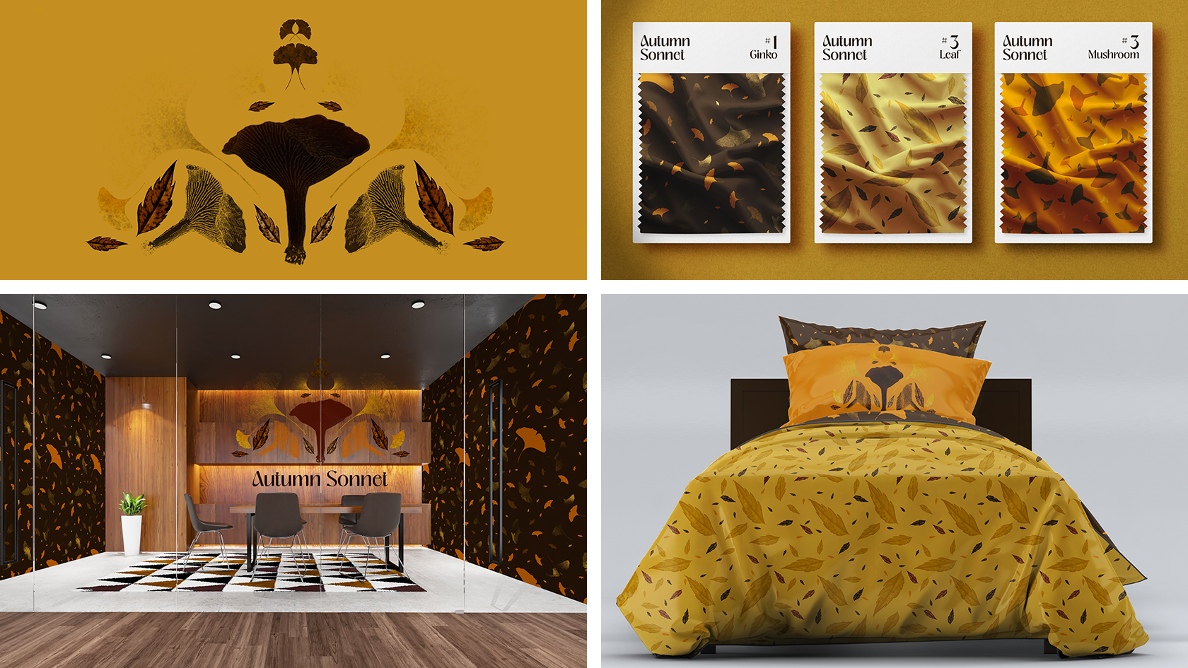
Autumn Sonnet
Autumn Sonnet surface design is crafted to inspire creativity, much like our beautiful environment. The motion and depth of the patterns are meant to add space to any room. In Autumn Sonnet, you never feel stuck, even when you are inside. My stamp brush designs are applied at different sizes, pattern to hero, in a cohesive repetition. The rotating elements twirl Autumn colors, giving cycle to mindful intention. The colors are chosen to complement diverse skin tones and natural interiors. The concept is meant to help people connect their internal rhythms to the natural world.
- Skills: Stamp Brush Creation, Color Concept Design, Surface Design, Pattern Design, Environmental Graphic Design, Interior Design, Hero Image Design, Layout Design
- Programs: Adobe Photoshop, Procreate